From logo design
to corporate design
and brand manual.
to corporate design
and brand manual.
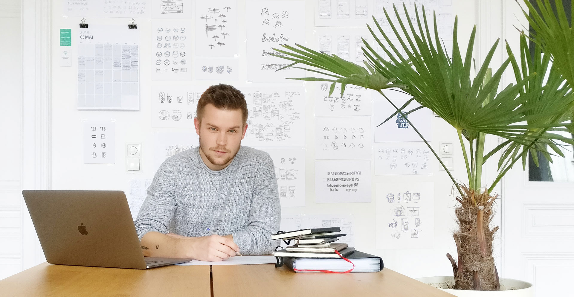
A brand encompasses the ideas, expectations, impressions, and reputation associated with it. It's shaped by product characteristics and visual elements from assets and advertisements. A brand becomes a cultural phenomenon when it interacts with people and lives in their minds. My approach to design a branding follows the "Golden Circle" concept (Why, How, What) to define and visualise a brand's core.
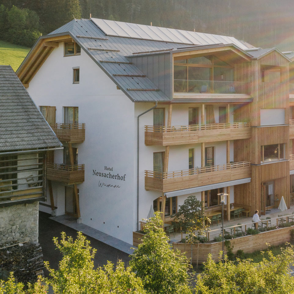
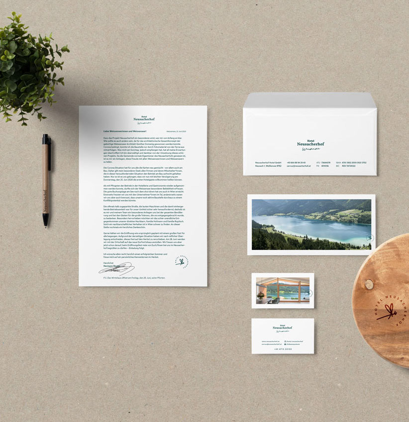
Core idea: The hotel's structure, which is based on the traditional architecture of this area, towers over the playful lake Weissensee.

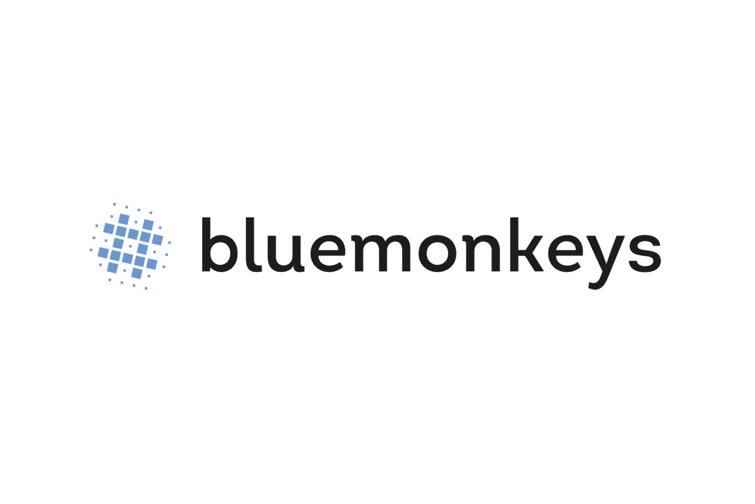
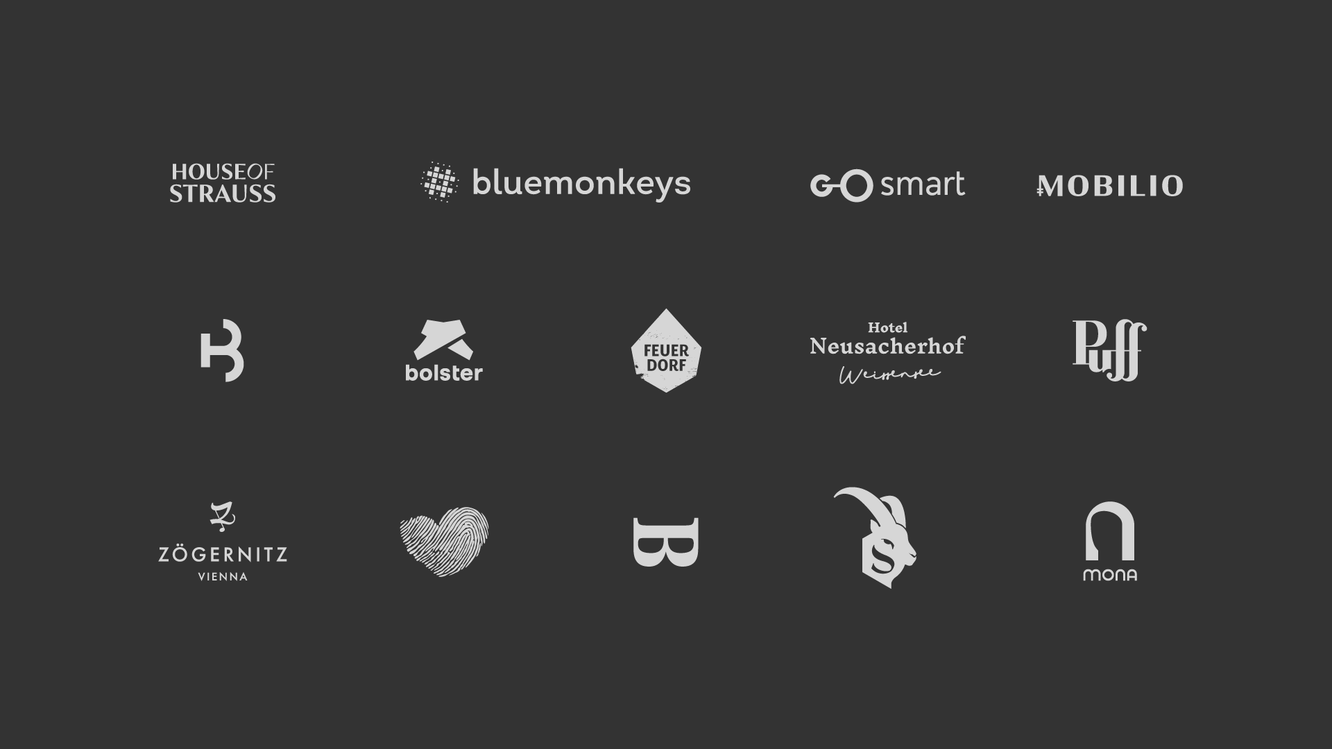
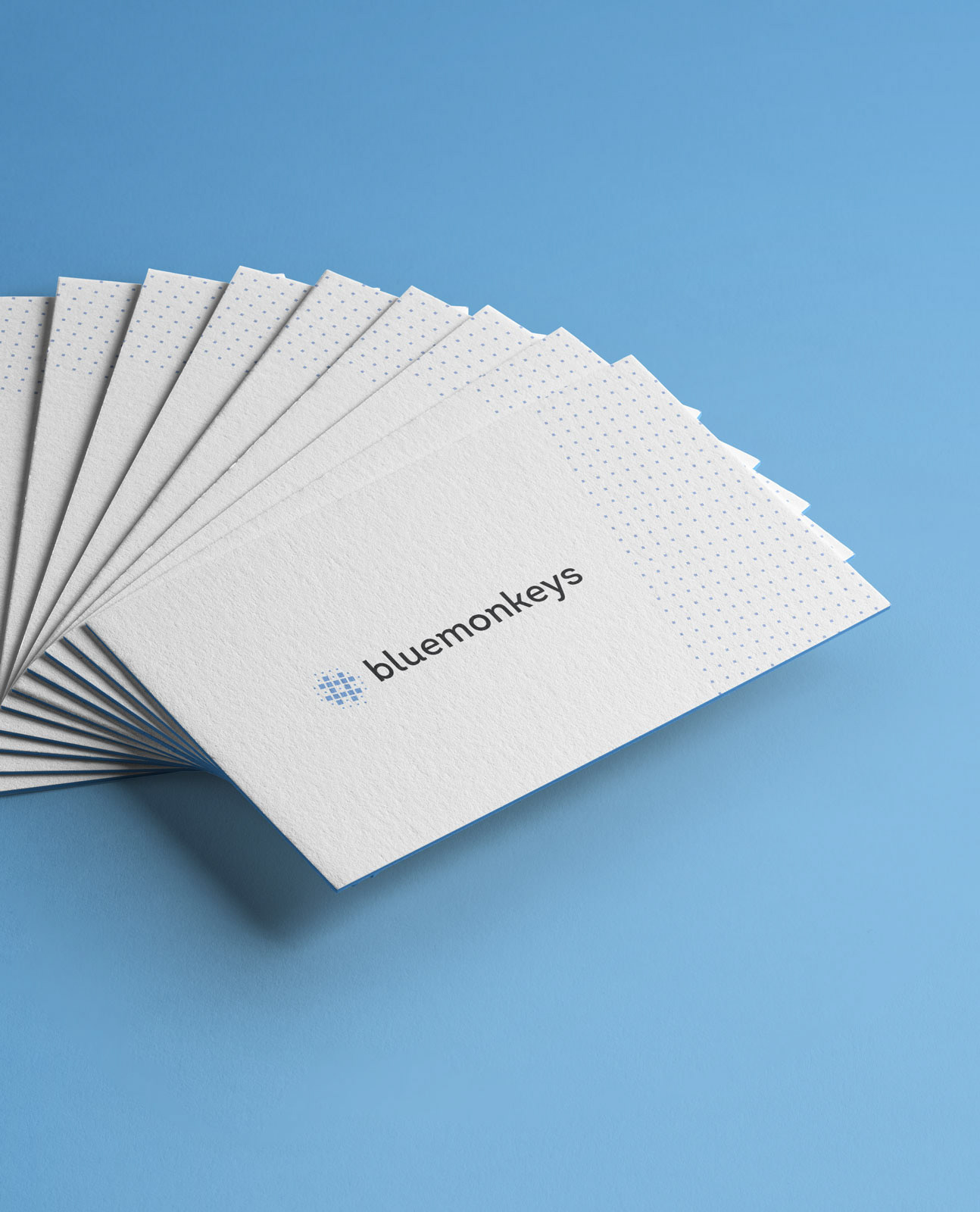
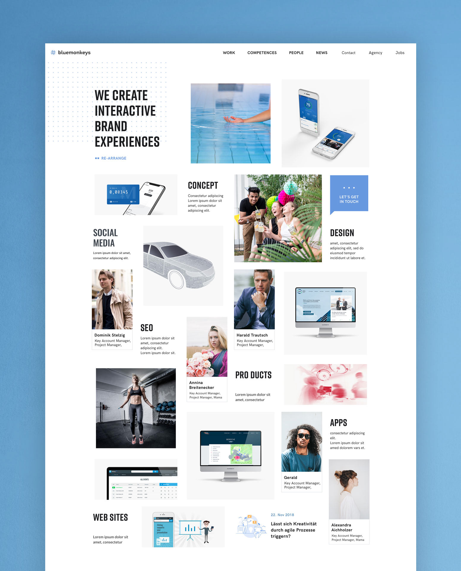
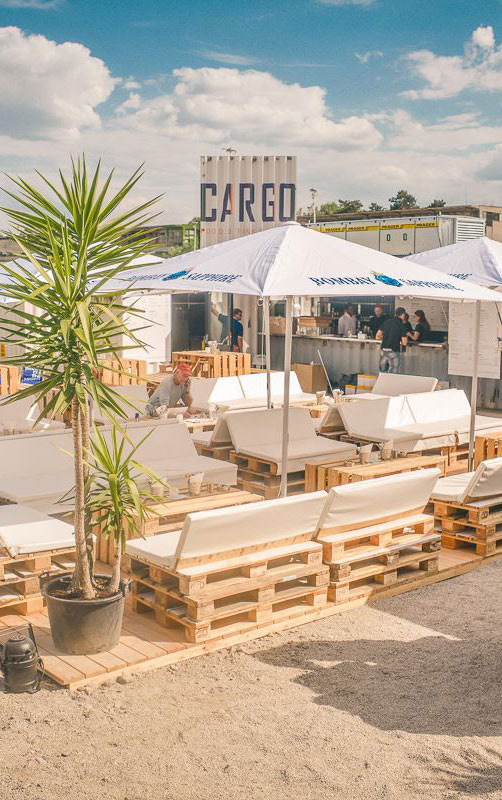
The Bluemonkeys are a digital agency crafting viral digital campaigns and websites. The only requirement for the logo design was not to draw a monkey. The customised font resembles the playfulness of monkeys in the jungle.
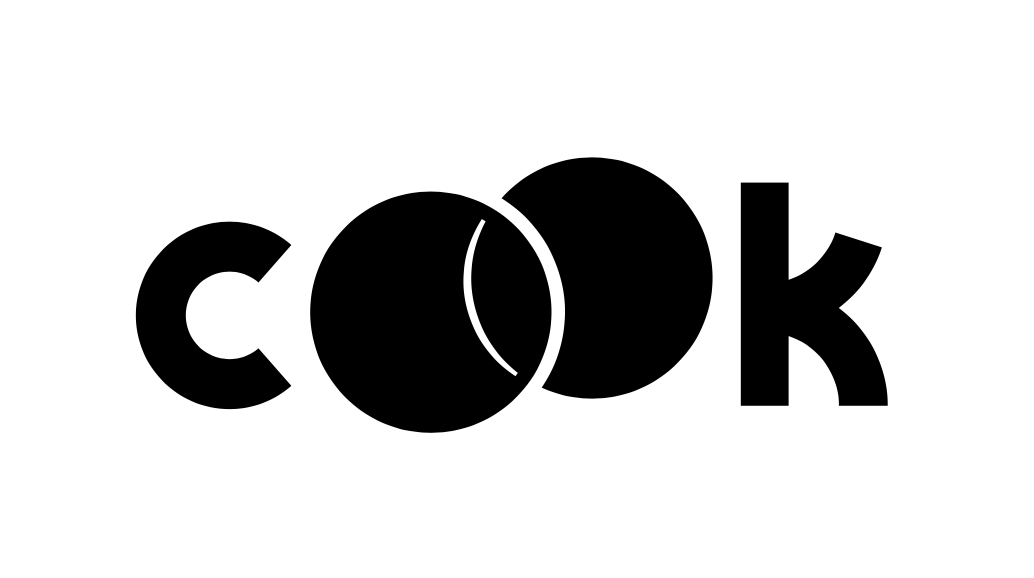
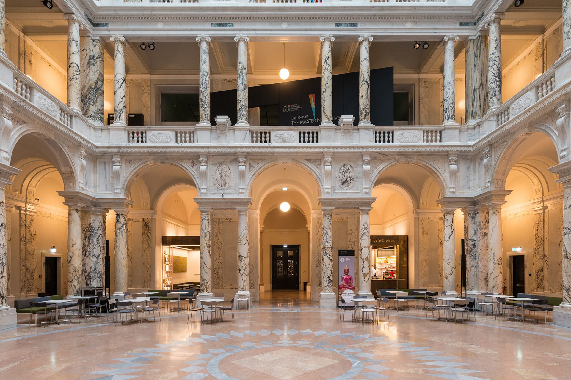
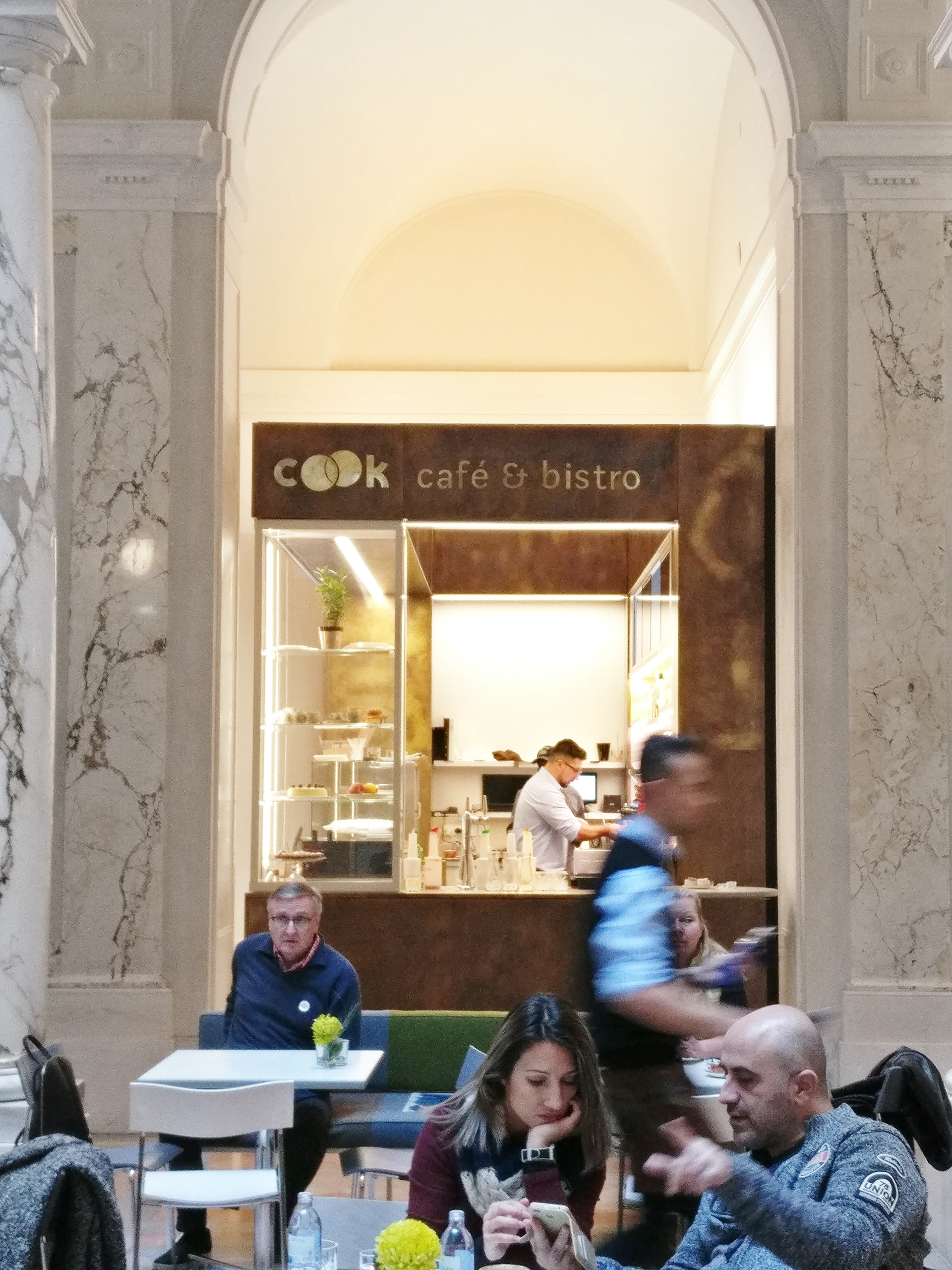
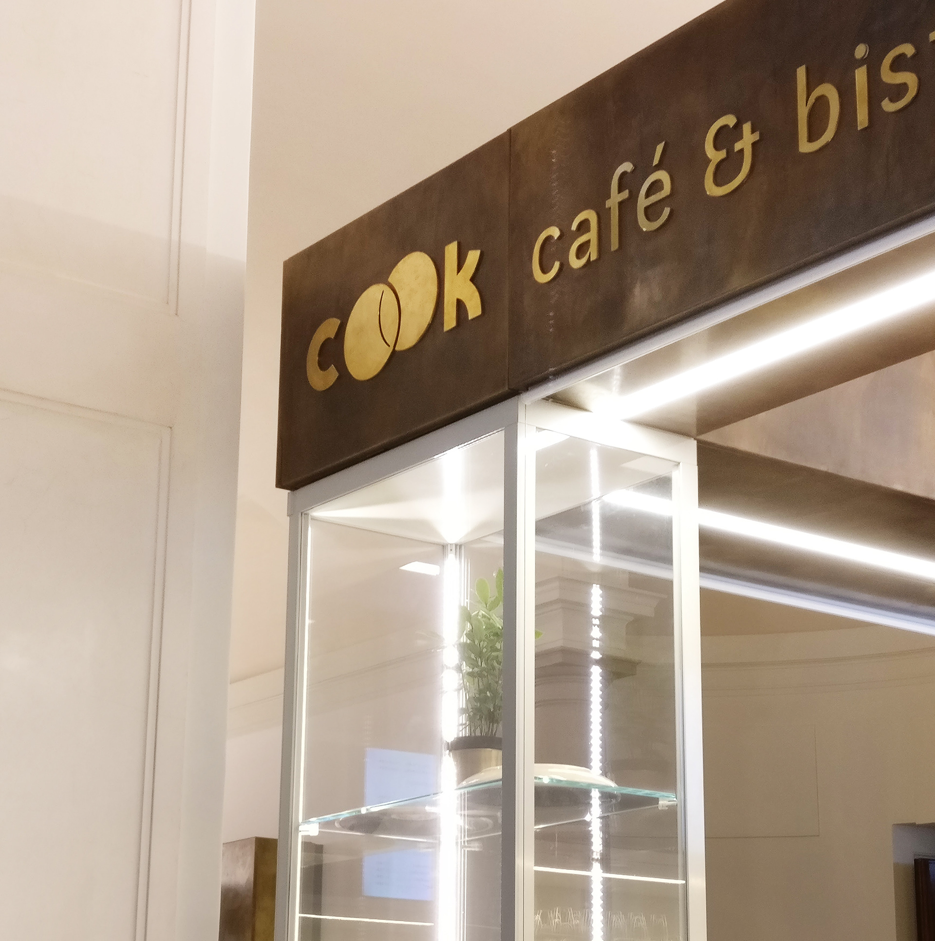
Cook is the restaurant in Vienna's "World Museum".
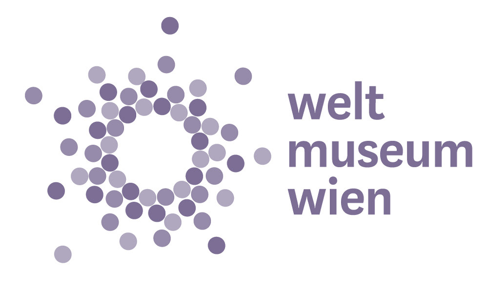
The logo takes up the logo of the World Museum, in which many circles represent a gathering of people. The restaurant is about people coming together and interacting. So the circles interlock.
The logo takes up the logo of the World Museum, in which many circles represent a gathering of people. The restaurant is about people coming together and interacting. So the circles interlock.
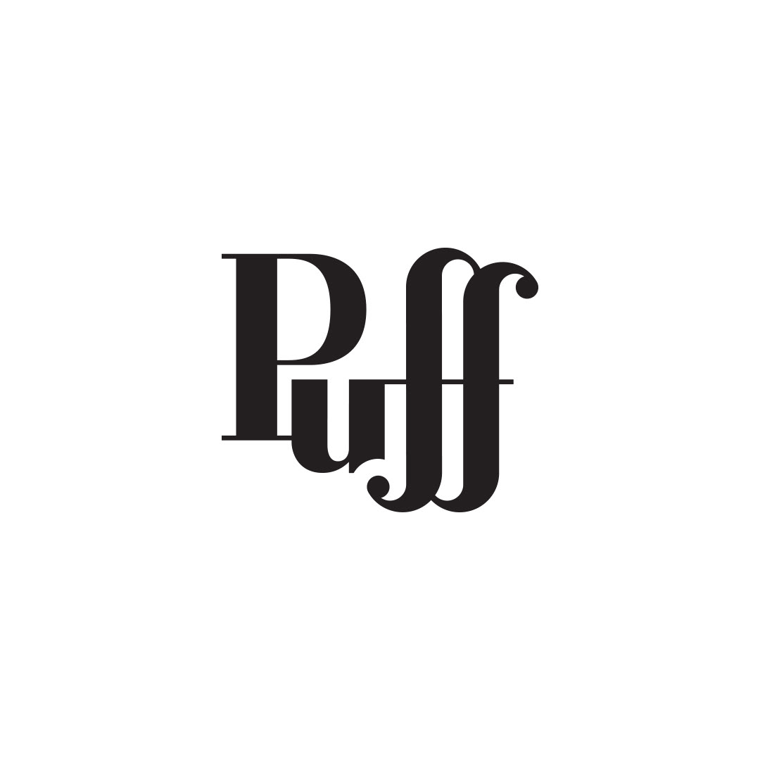
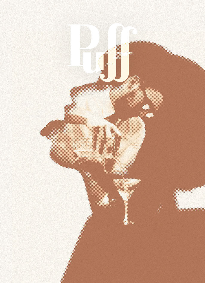
The Puff bar is a cigar and cocktail bar in Vienna, located in a former brothel. While clearly hinting at "puff a cigar", in German the word "Puff" is also slang word vor brothel. I wanted the logo to have elegant feminine shapes and to resemble rising clouds of smoke.
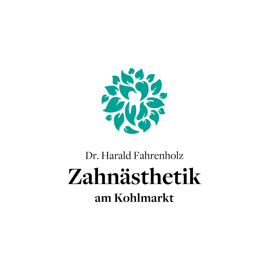
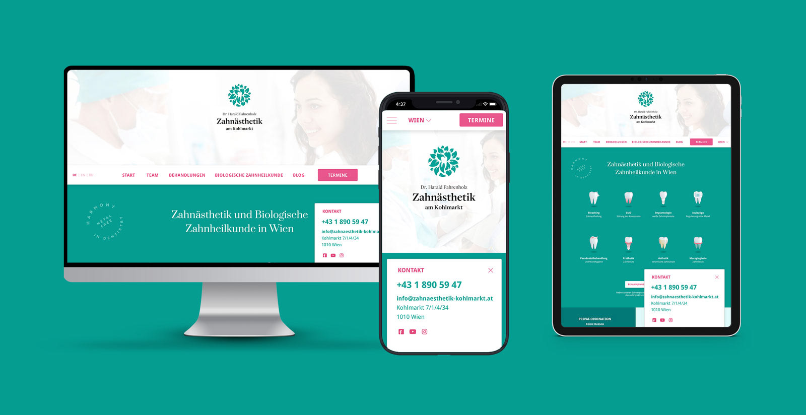
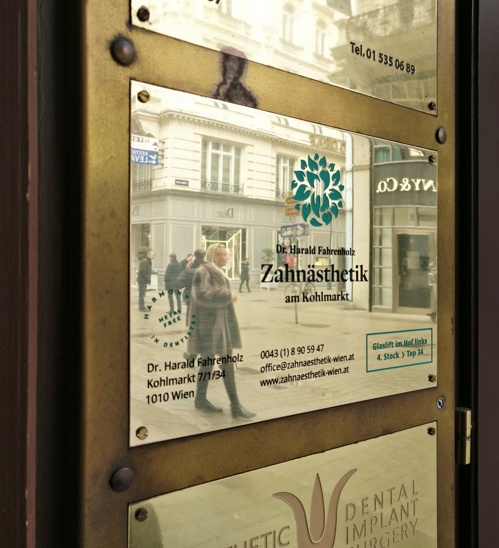
This dentist specialises in biological/ holistic dentistry and does everything metal free. The logo shows natural shapes that gently caress a tooth.

Mein Hof Mein Weg (My Farm, My Path) is an innovation offensive by the Austrian State Economic Chamber . The logo is reminiscent of a leaf, but also of cultivated fields.


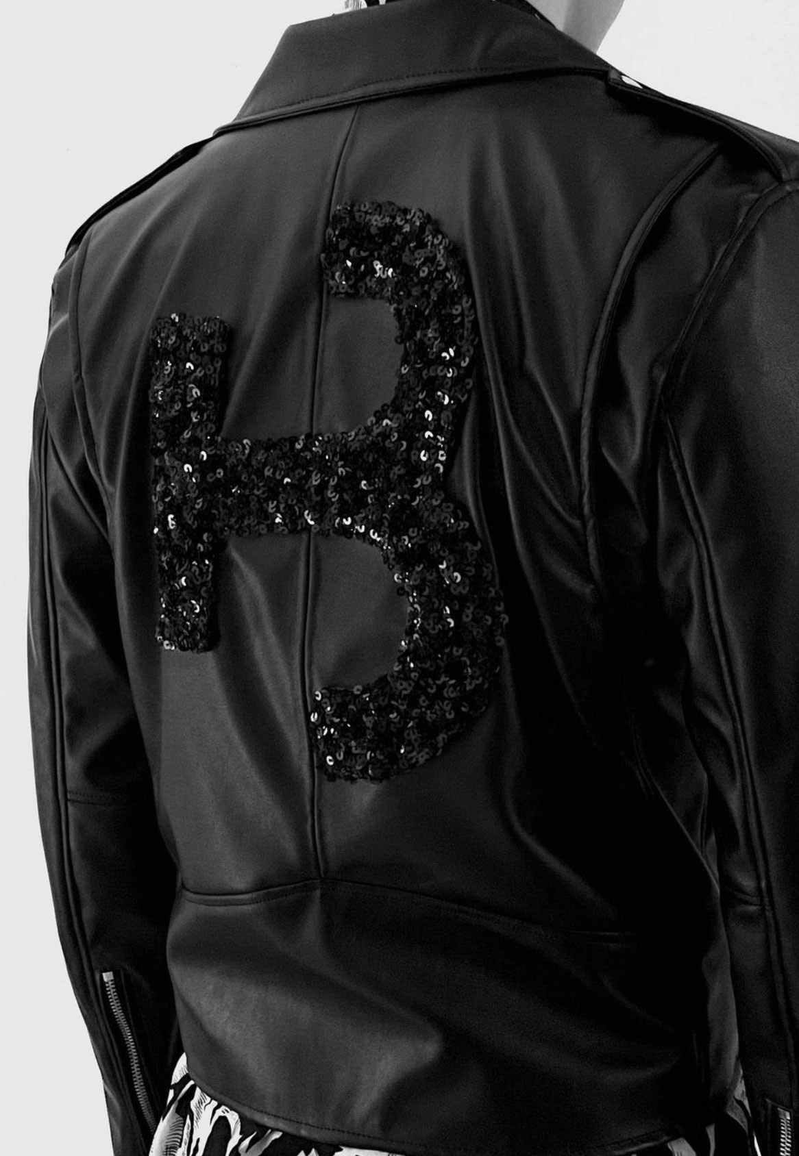
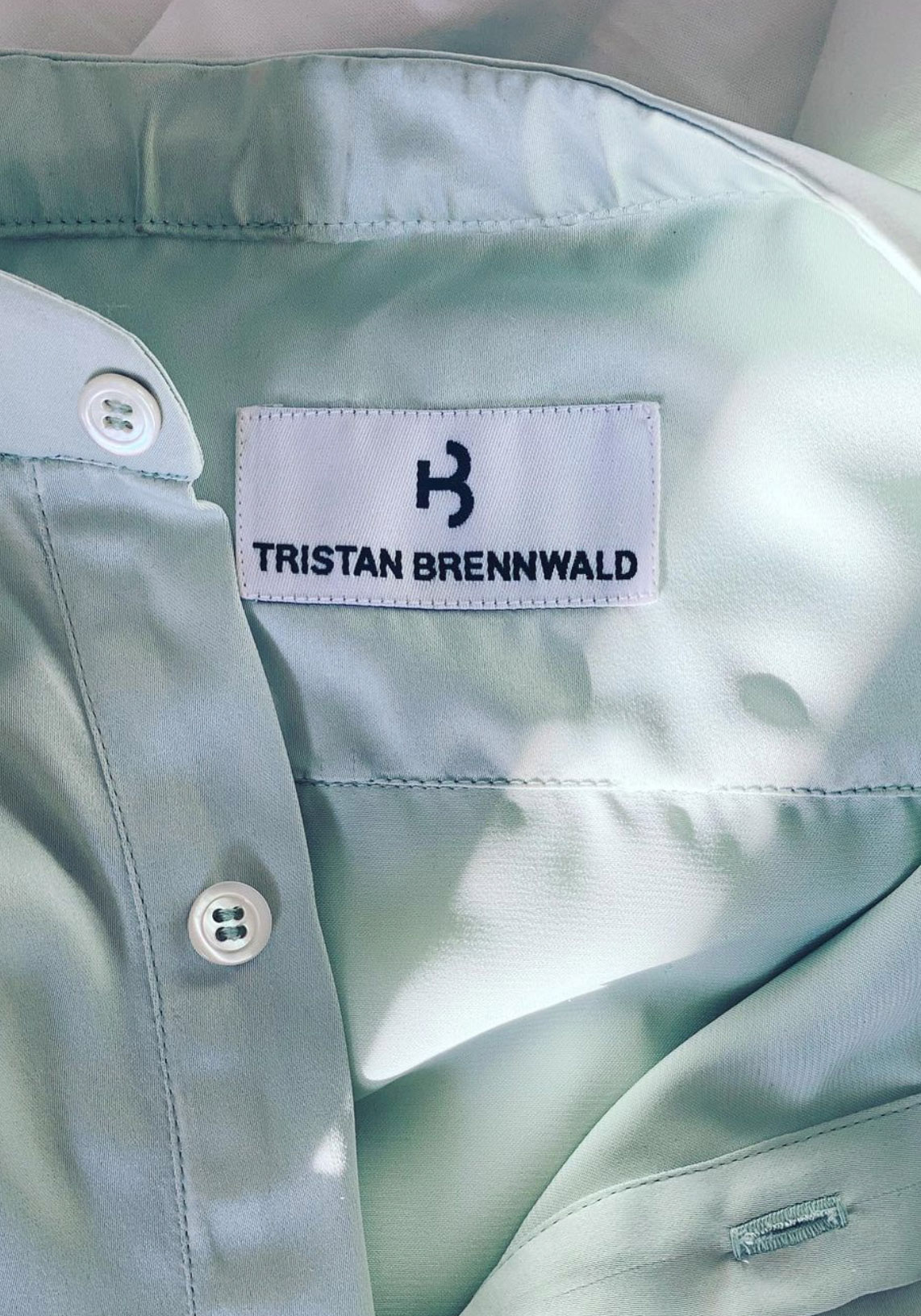
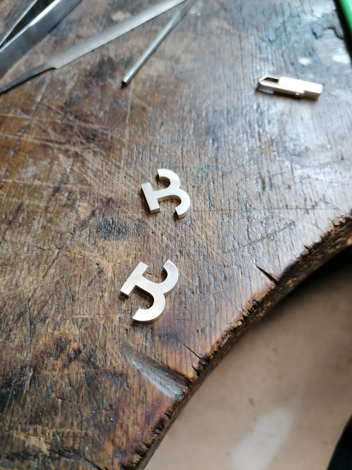
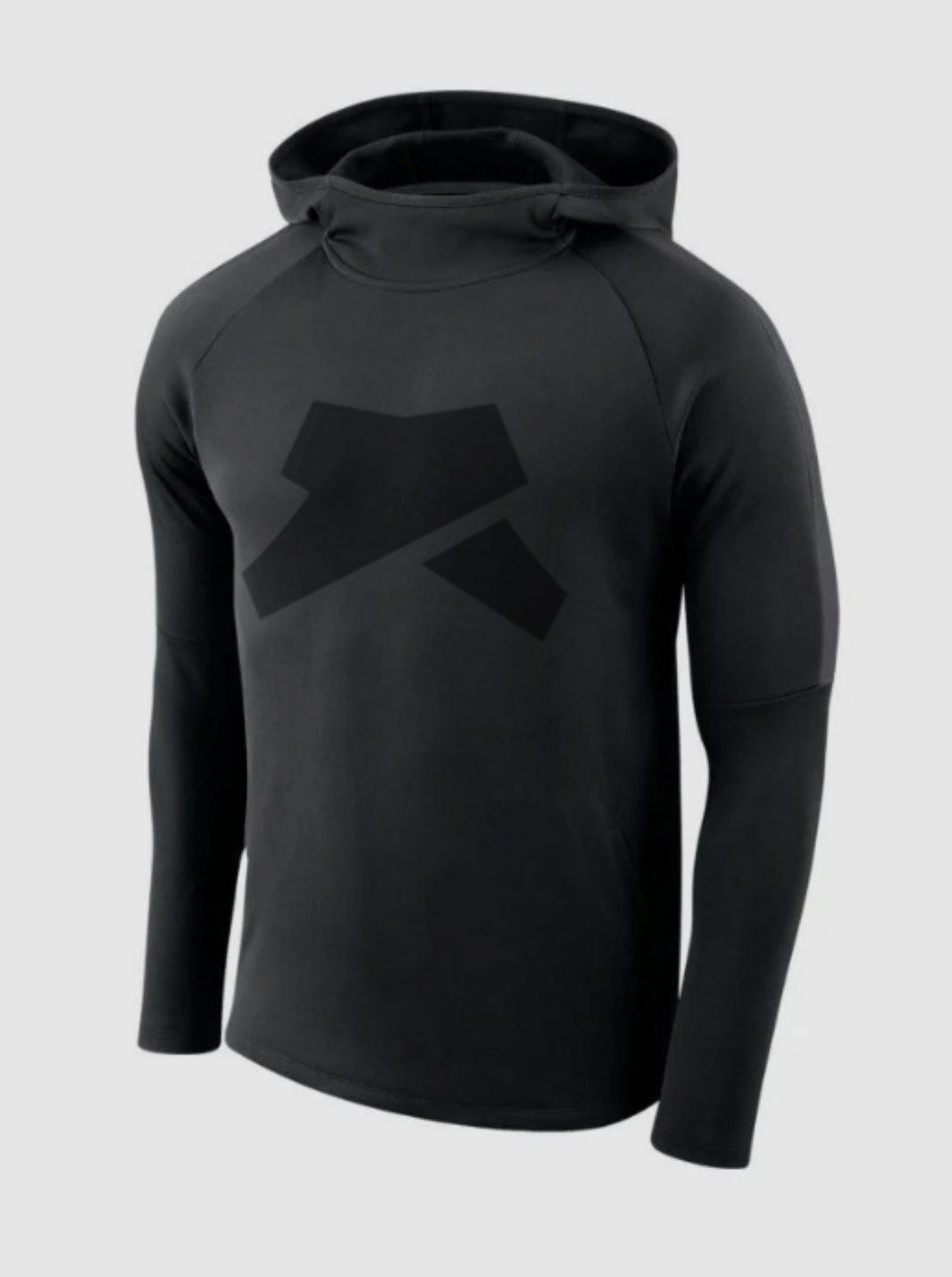
For my brother's fashion brand I wanted to create an iconic, yet minimalist symbol. At it's core it's a T and B. The cutouts lead to interesting interpretations and allow new shapes to emerge. Just like in fashion
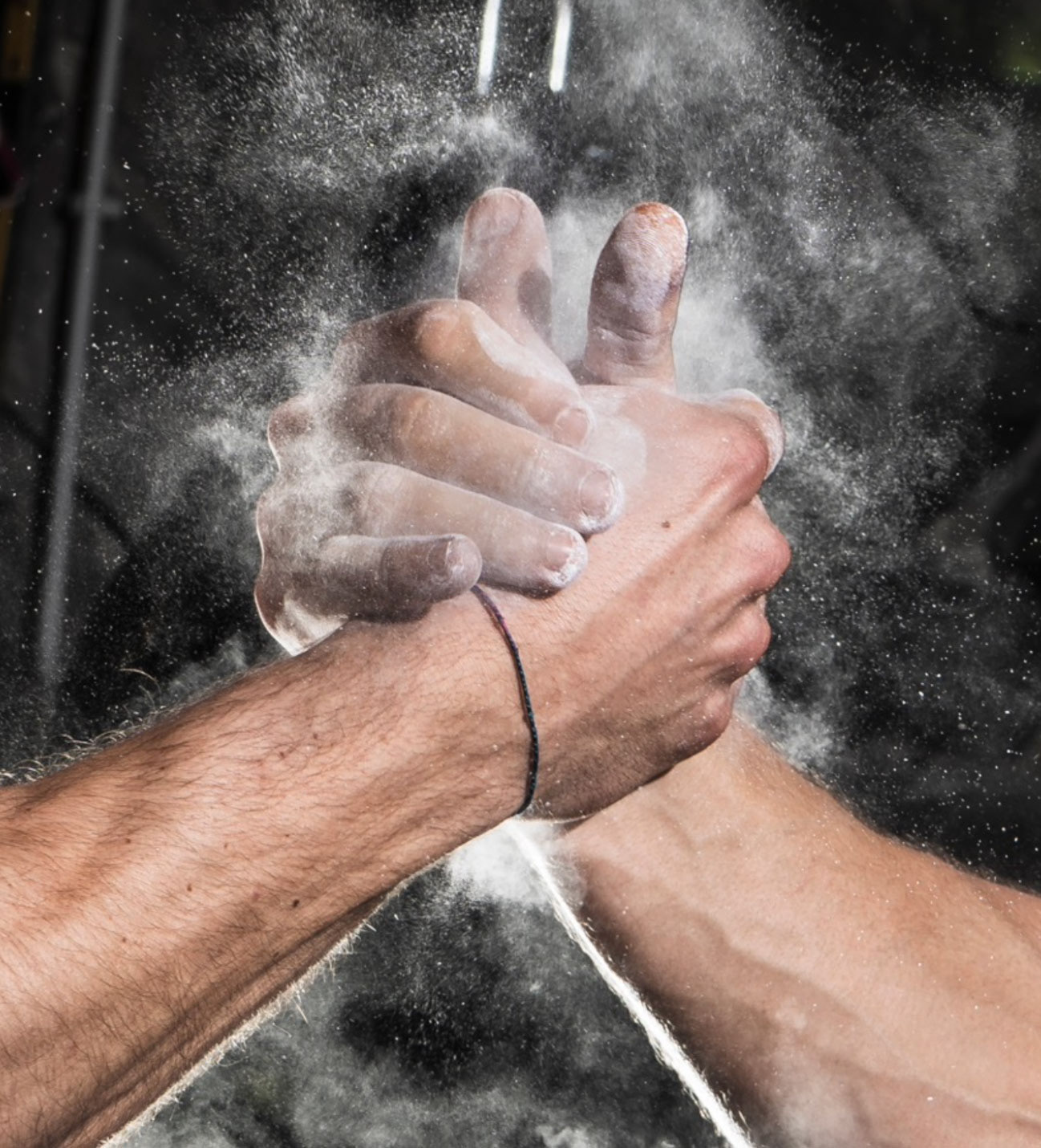
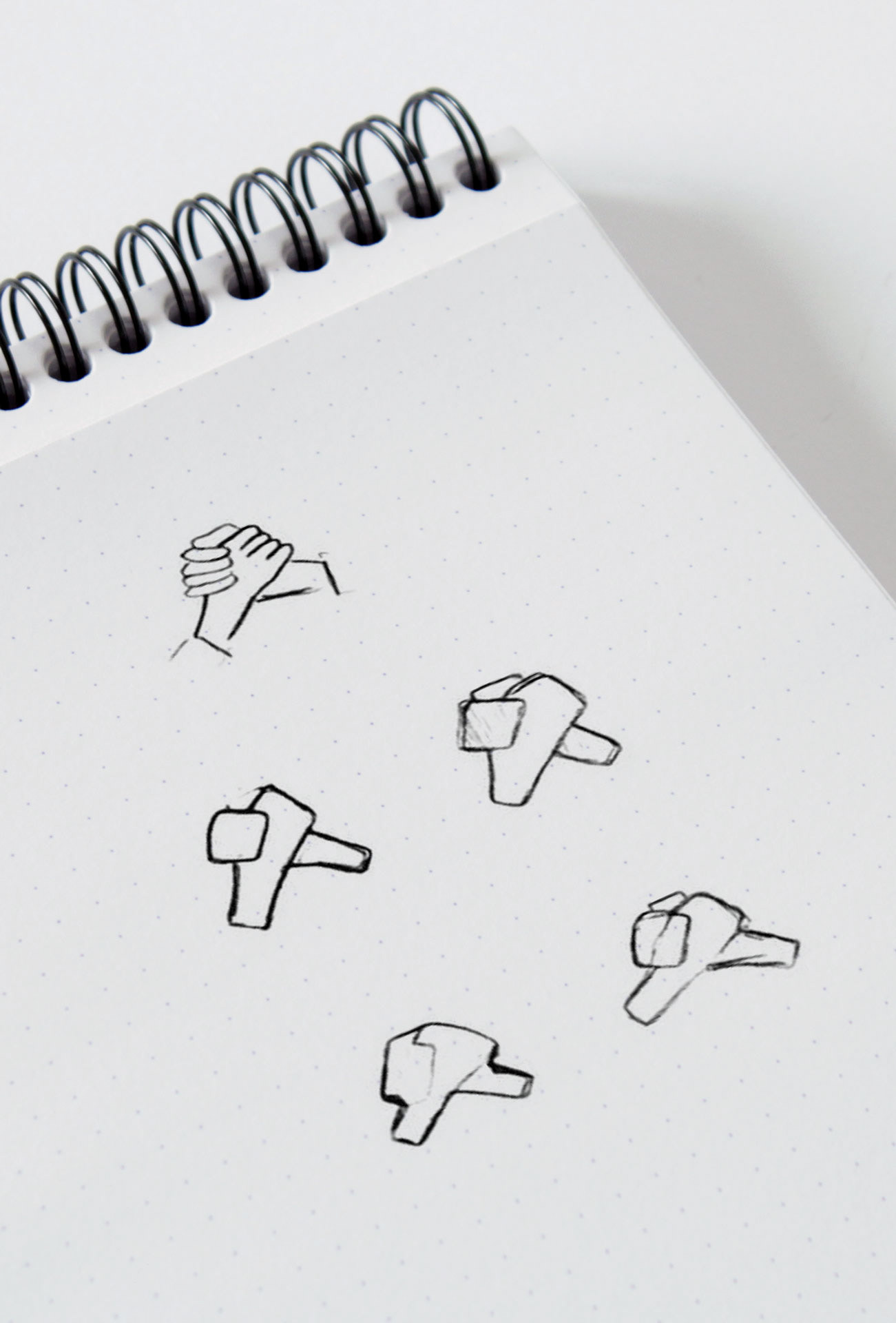
This is a British sports fashion brand. "Bolster" means "Support & Strengthen". The logo shape is an interpretation of the iconic handshake of athletes.

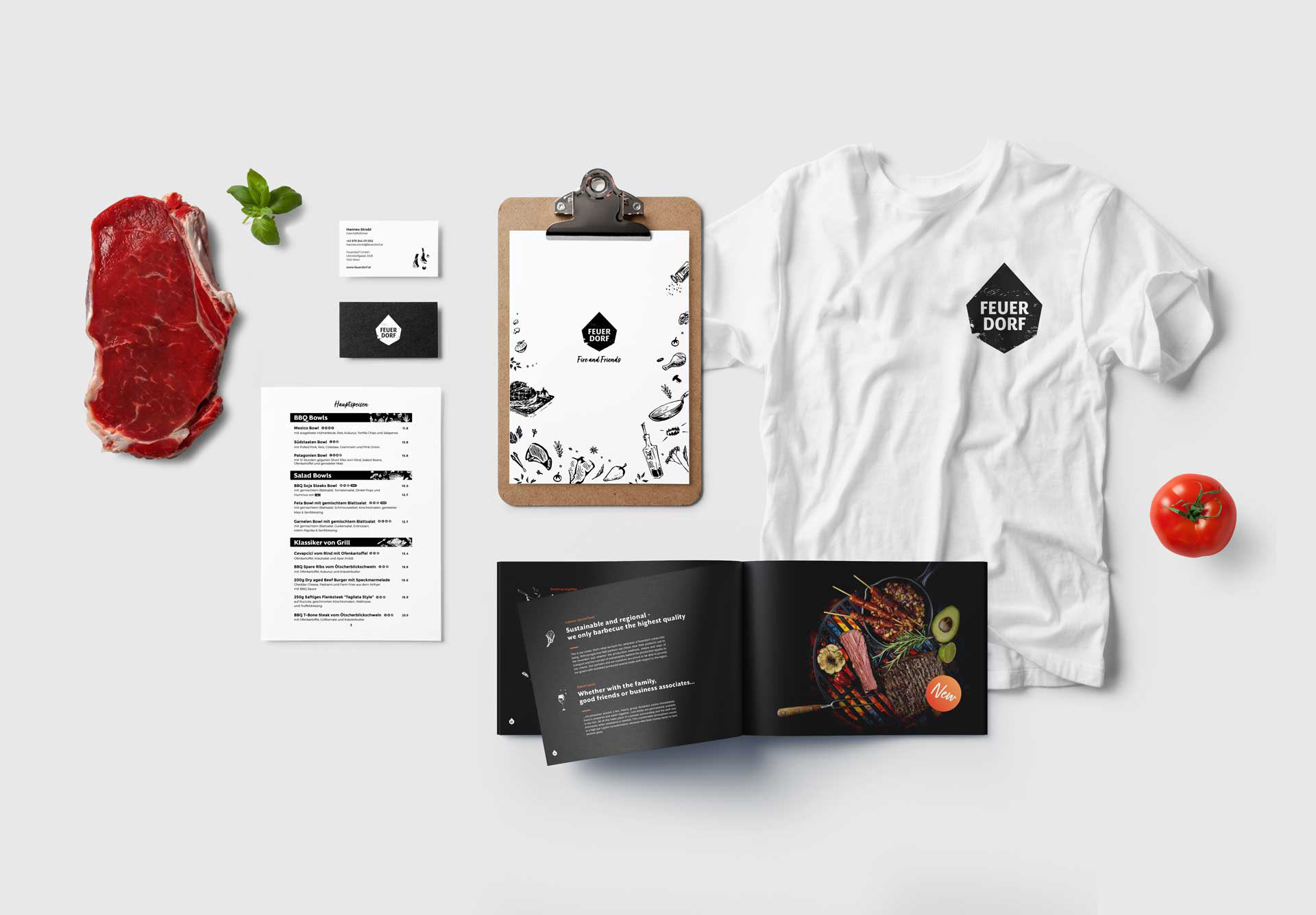
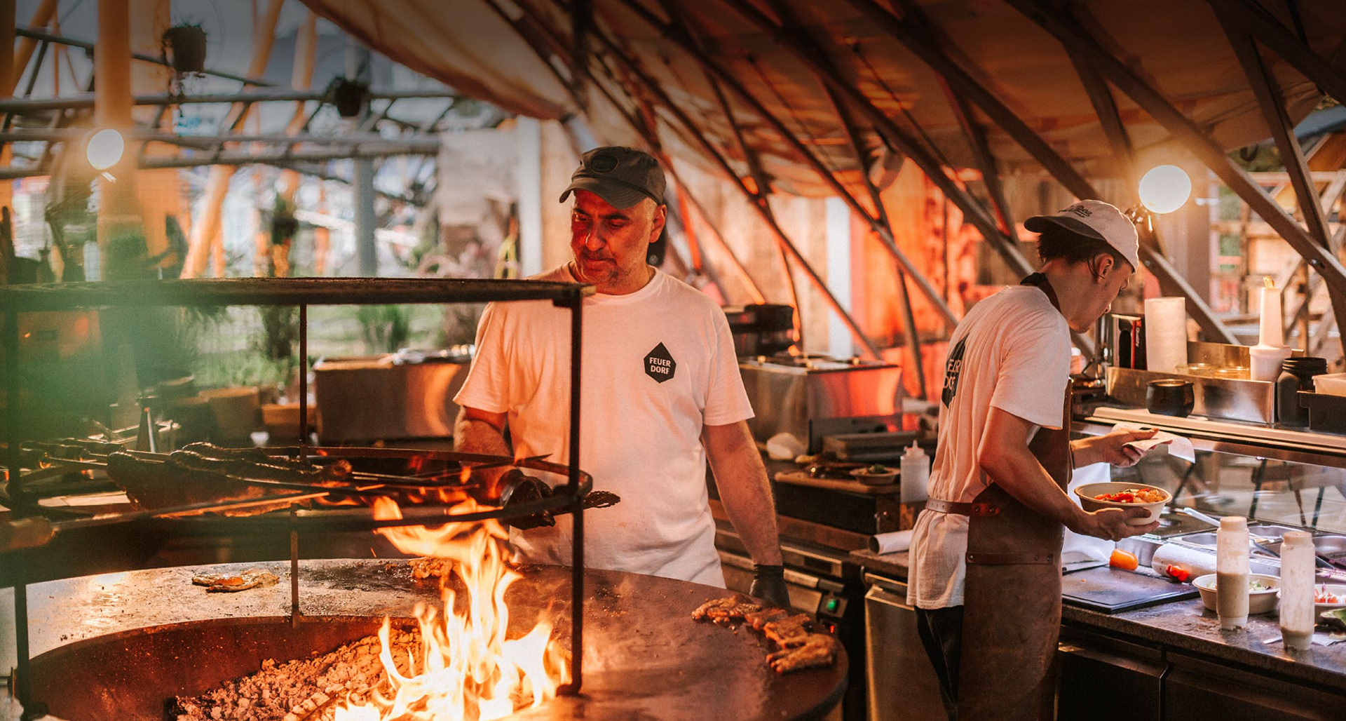
The Feuerdorf (Fire Village) is a rustic concept restaurant where people sit around a fire pit in wooden huts and grill. The logo takes on the iconic shape of the huts and the font dances a bit like fire.

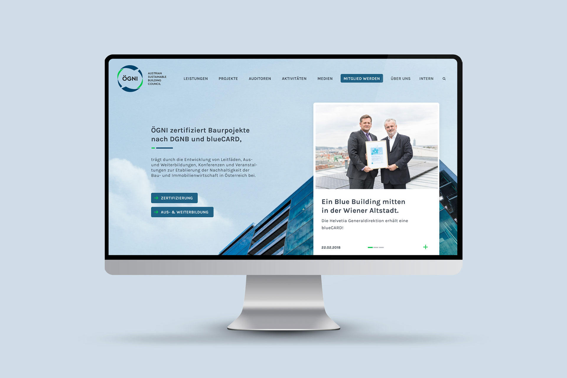
ÖGNI is an Austrian award for ecological construction projects. The logo is based on circular processes.


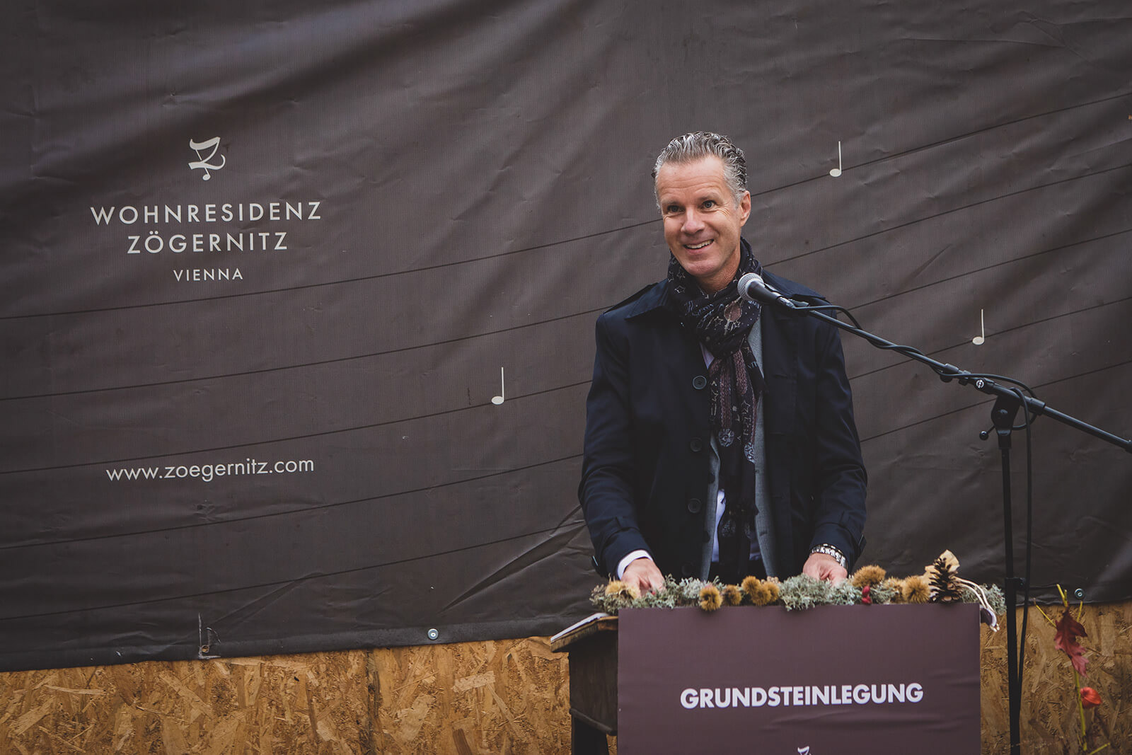
The Zögernitz is a historic building in Vienna, originally built to host concerts. It was renovated and reopened along with two newly apartment complexes. This logo is used for the apartment complexes. It needed to remind of the estate's musical roots while communicating a timeless elegance.


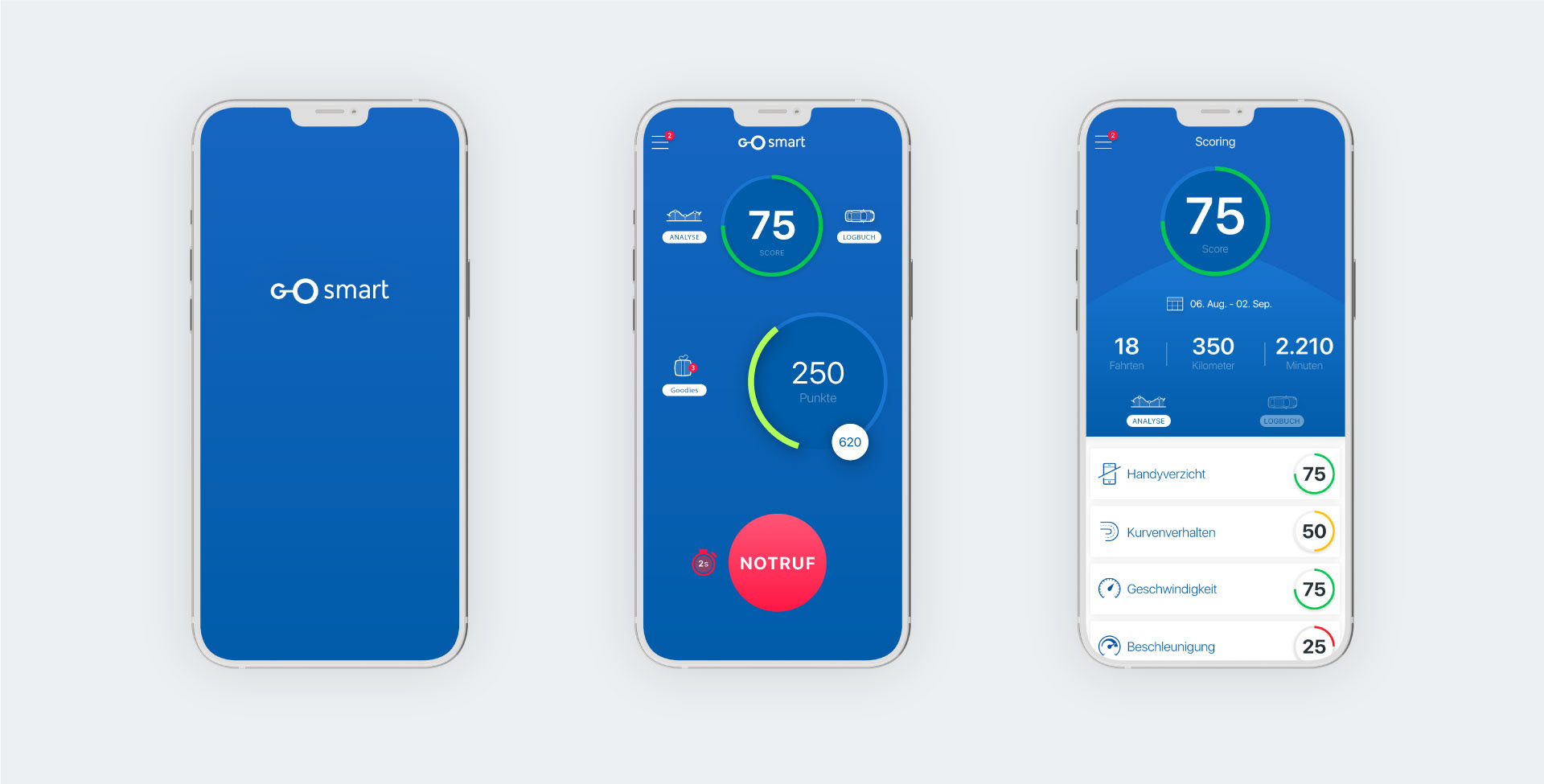
Go Smart is a mobile insurance service that tracks and rewards users' driving behavior. The app is mainly about the routes taken and planned. The logo visualizes exactly that.
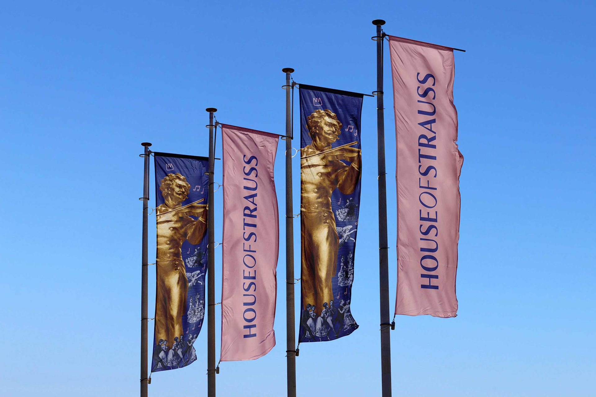
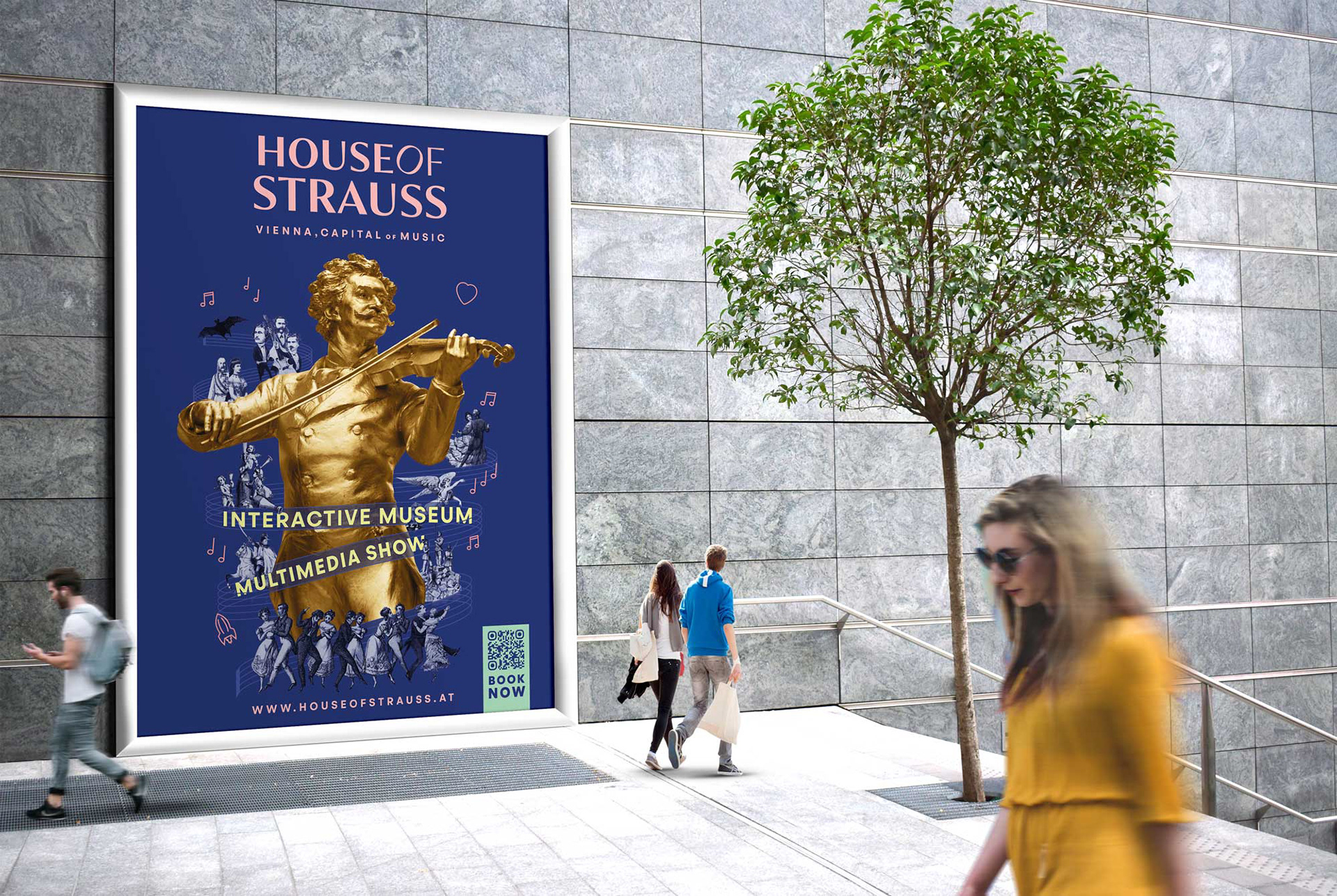
The House of Strauss is Vienna's new museum about the Strauss dynasty around the Waltz King, Johann Strauss. The logo needed to be most flexible for all kinds of print and digital communication, yet convey a sense of history that is transported into the present.


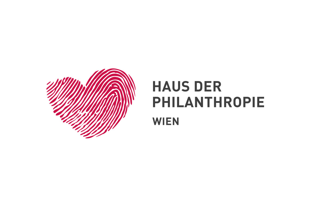
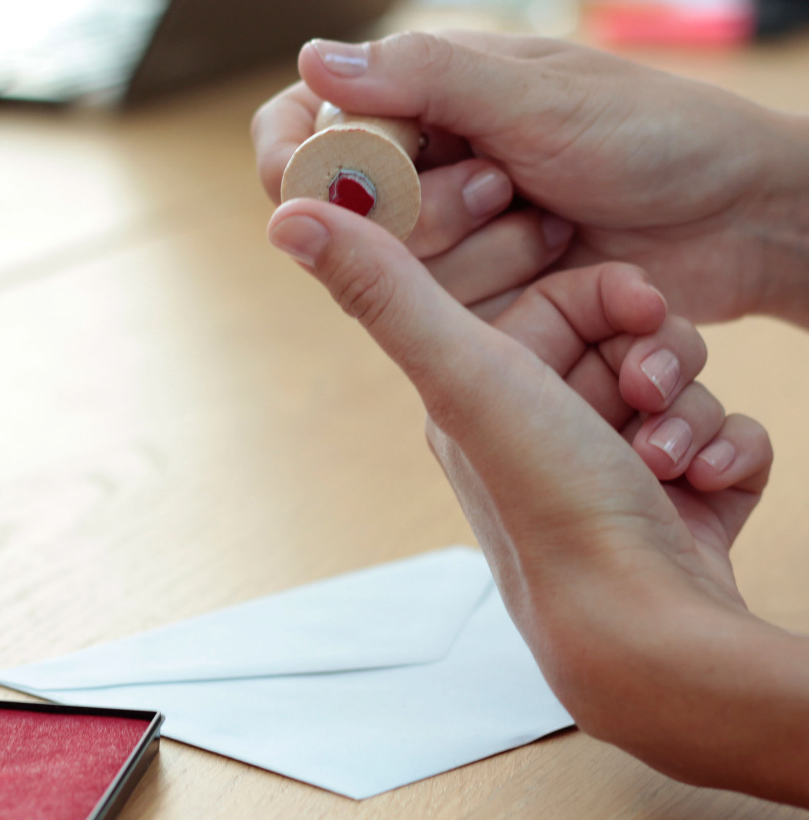
The House of Philanthropists is a joint office of socially active foundations with a heart for humanity.
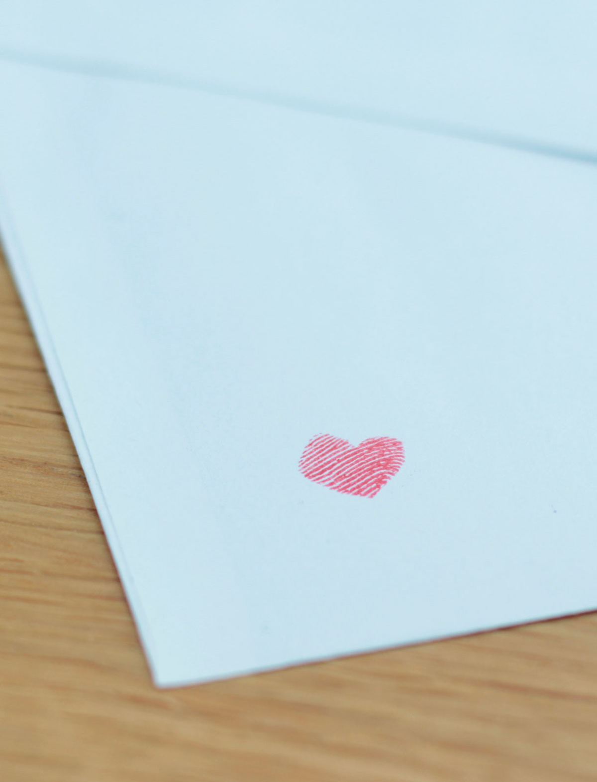
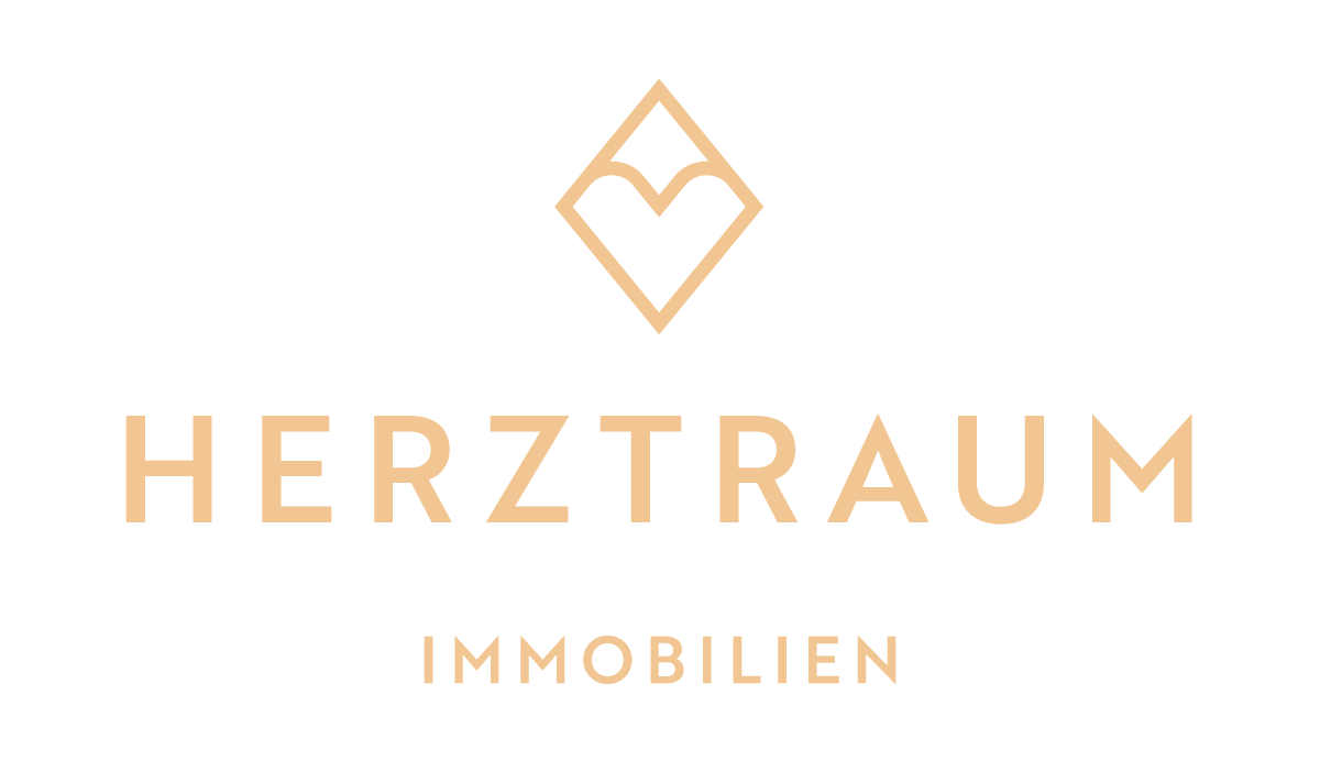
Herztraum (Heart Dream) is is a real estate developer that supports children's aid projects with half of its profits. The last name of the founder, Hermann Rauter, means “rhombus". Hence the logo is a heart in a rhombus, which also reminds of a roof.